Company
SAN FRANCISCO AIDS FOUNDATION
Riding to End AIDS, creating community and fostering relationships.
I worked with SFAF from 2008-2016 across a number of their brands and events. My first project was with a newly minted events program, Greater than One, formed to capitalize on fundraising through athletic events. As with all my engagements with SFAF, I was hired to develop an overall brand vision – visual language and system, tone and personality for the brand. In the case of >1, I also developed the identity.
The >1 program's pilot event was a 2 day 100 mi bike ride, the Seismic Challenge. I created the identity and branding for the program and led that design effort 4 years over 4 different campaigns.
I was then asked to overhaul the AIDS/Lifecycle website, which began my journey with ALC as created unique campaigns and branded the event each year. With so many repeat riders, participants and donors, the event branding and all it’s enduring visual digital, physical, and posterity touchpoints; needed to allow for distinction within each campaign. The goal being to drive signups and donations among those that will participate in the event year to year and may experience campaign and messaging fatigue – which could lead to apathy and reluctance to participate.
I was then asked to overhaul the AIDS/Lifecycle website, which began my journey with ALC as created unique campaigns and branded the event each year. With so many repeat riders, participants and donors, the event branding and all it’s enduring visual digital, physical, and posterity touchpoints; needed to allow for distinction within each campaign. The goal being to drive signups and donations among those that will participate in the event year to year and may experience campaign and messaging fatigue – which could lead to apathy and reluctance to participate.
Riding the success of the ALC website re-launch, the San Francisco AIDS Foundation entrusted me with their flagship brand to lead, design and launch a newly rebranded, repositioned sfaf.com.
I am extremely proud of my time with SFAF. I created and branded dozens of experiences and helped make lasting, memorable impressions on people lives in a way commercial experience often can’t quite match. Every minute I spent working with the teams, I felt like I was helping the mission – to end the stigma around HIV, and end AIDS in our lifetime.
Projects

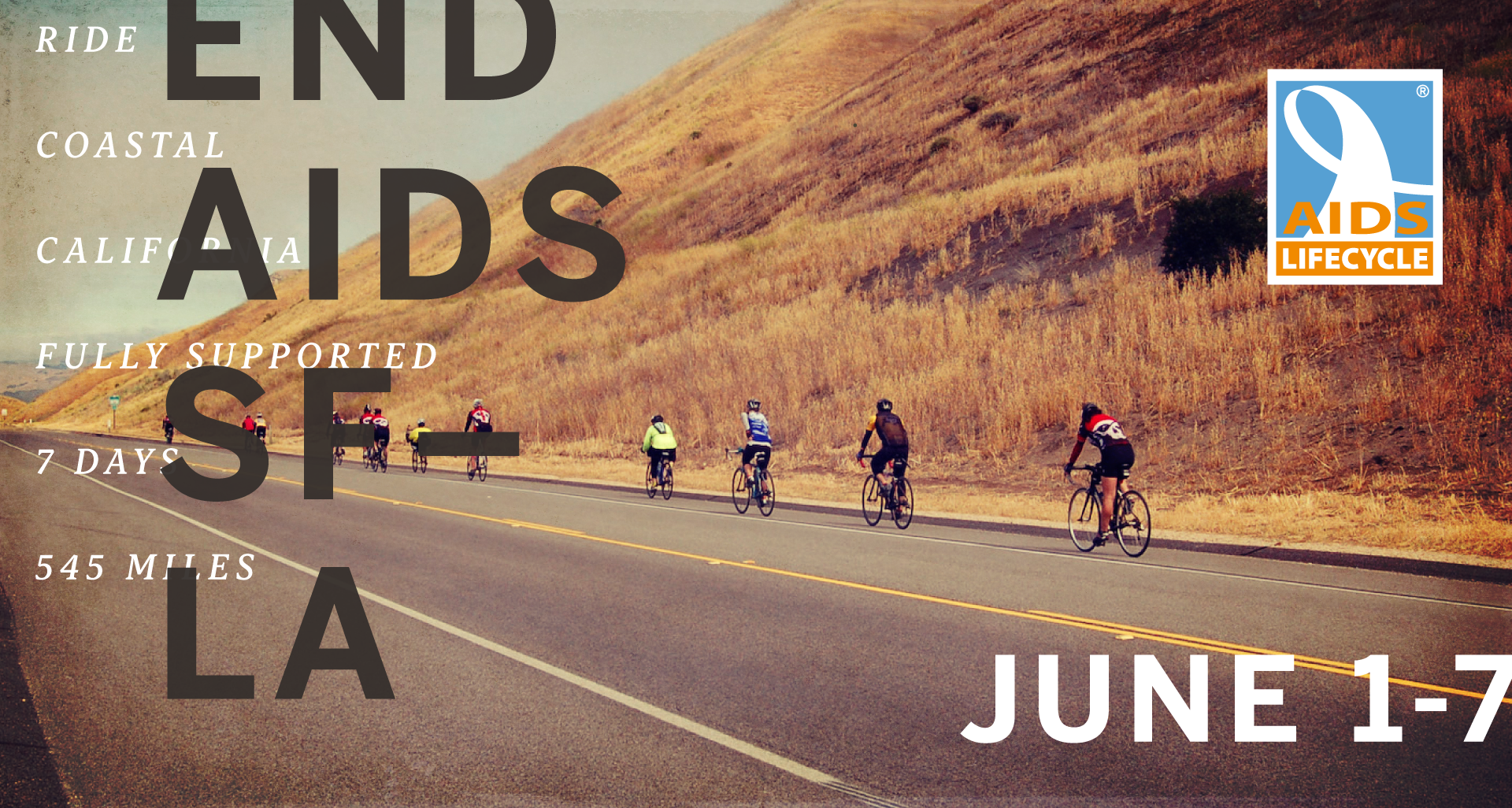
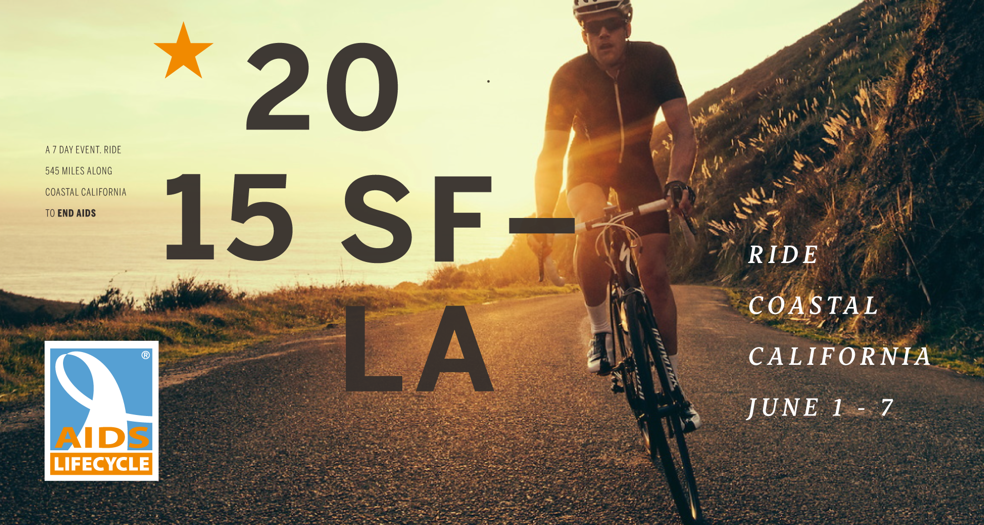
AIDS/LifeCycle – 2015
Approachable and Inclusive
AIDS/LifeCycle – 2015
Approachable and Inclusive
Each year from 2010-2016 I worked with ALC, to developing and executing on the event campaign branding. Over the course of our engagement we established key brand positioning, visual and tone tenants that served as a thoughline that connected the brand from year to year, but allowed for enough storytelling differentiate and distinguish the campaigns.
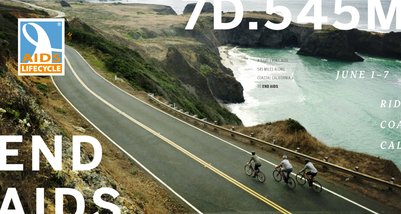
2016’s campaign featured theme a hand lettered identity and thematic messaging – Ride 545 – that evoked a sense of direction, individualism, and action. The enduring brand themes of authenticity, inclusiveness, and approachability are persistently visible in the photography and messaging copy and tone.
Each year from 2010-2016 I worked with ALC, to developing and executing on the event campaign branding. Over the course of our engagement we established key brand positioning, visual and tone tenants that served as a thoughline that connected the brand from year to year, but allowed for enough storytelling differentiate and distinguish the campaigns.
2016’s campaign featured theme a hand lettered identity and thematic messaging – Ride 545 – that evoked a sense of direction, individualism, and action. The enduring brand themes of authenticity, inclusiveness, and approachability are persistently visible in the photography and messaging copy and tone.
My Role
Campaign Creation, Visual Design, Web Design, Print Advertising, Collateral, Apparel Design
Campaign Creation, Visual Design, Web Design, Print Advertising, Collateral, Apparel Design
Credits
Greg Sroda – Sr. Event Director, Derek Martin – Associate Event Director, Chris Stewart, Georg Lester – Photography, John Burns – Hand Lettering


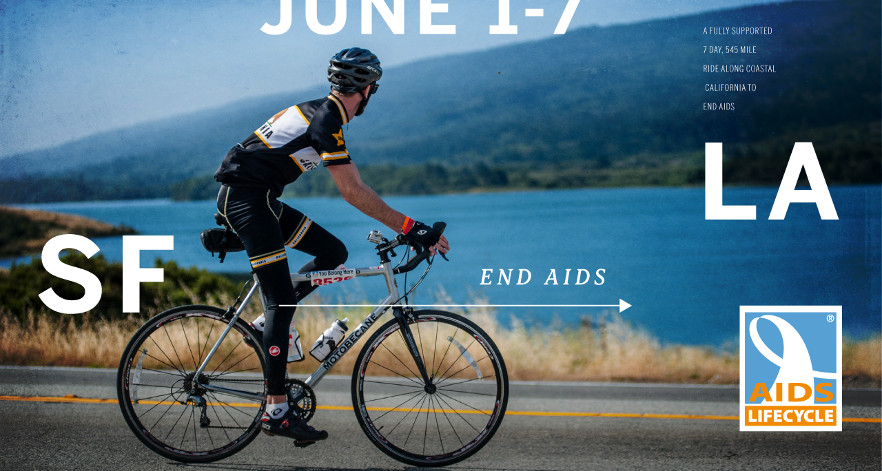
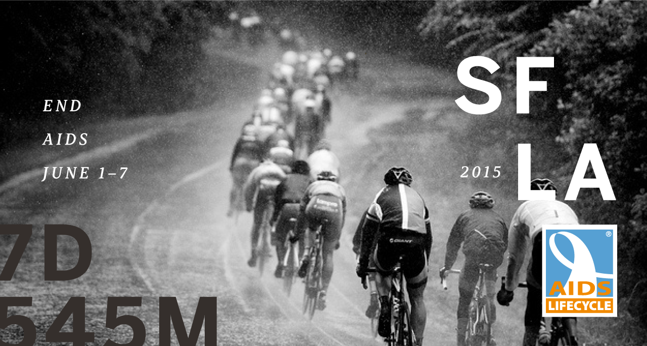
AIDS/LifeCycle – 2014
Showcasing the beauty of the ride and the multitude of experiences
AIDS/Lifecycle secondary tagline is “An experience of a lifetime”. The ride is scenic, iconic, and 7 day journey comprised of hundreds of memorable moments. The strategy was to emphasise those moments and that journey.
Both the ride and California aspect of the event are highlighted with a bold lock up of SF, LA, Bike Icon (ride) and Star (CA), symbolizing those elements. The system extends to a repeatable but interchangeable lockup design motive that allows for flexibility of messaging and layout, but a recognizable thematic campaign continuity. The sheer beauty of the ride and the different topography encountered were showcased with sweeping panoramic and idyllic wide shots, but balanced with close in candid shots of happy riders. Via a flexible visual system, the varied layouts of images provided a nod to individualistic moments. Photo filters were applied to add a sense of nostalgia around the event.
My Role
Campaign Creation, Visual Design, Web Design, Print Advertising, Collateral, Apparel Design
Campaign Creation, Visual Design, Web Design, Print Advertising, Collateral, Apparel Design
Credits
Greg Sroda – St. Event Director, Derek Martin – Associate Event Director, Chris Stewart, Georg Lester – Photography


Seismic Challenge
A Challenging ride for more experienced riders
Seismic Challenge was another fully supported ride event designed for a shorter 2 day time commitment and a more seasoned rider. The course changed from year to year, but always followed a route along the one or many fault lines of Northern California.
With the goal of reflecting the unique experience of each ride, the event branding visuals evolved from year to year. Thematically they secquenced together by all sharing the notions of seismic activity, motion, and athleticism. Additionally we wanted to design jerseys and apparel the riders would reach for ride after ride, to help with recruitment and brand awareness. The identity pulled together the notion of AIDS and fundraising with the red ribbons in the symbol, as well as the ride, the route, and the athleticism needed through the symbol, the wordmark, and the language respectively.
My Role
Campaign Creation, Identity & Brandmark, Visual Design, Web Design, Print Advertising, Collateral, Apparel Design
Campaign Creation, Identity & Brandmark, Visual Design, Web Design, Print Advertising, Collateral, Apparel Design
Credits
Robert Pinnix – Sr. Event Director, Robin Easterbrook – Event Specialist, Chris Stewart – Photographer


San Francisco AIDS Foundation
Take Action. Learn. Be Easy. Be Bold.
SFAF had just finalized a new mission as well as 3 key goals they aimed to achieve – reduce new HIV infections, increase self knowledge of HIV stats, and provide care to all HIV+ individuals.This new focus and messaging crystallization needed to be reflected in their digital presence.
We mobilized around a few key principals – Education, Empathy, Approachability, Activism, Positivity – which guided our design approach and visual system. Bold bright colors. Large type. Clear messaging and limited marketing speak. Unambiguous intent and goals. Inclusion and broad representation. The bright yellow and black brand colors, are memorable, bold, and promote action. The rainbow of other brand colors inclusive, hopeful and provide meaningful wayfinding.
My Role
Creative Direction, Web Design, User Experience, Visual Design, Collateral, Illustration, Iconography, Print Advertising
Credits
James Loduca – SVP Marketing & Communications, Alex Bernardin – Digital Content Manager, Ryan McKeel – Communications Manager, Craig A. Wingate – Marketing Manager, Selino Valdes – Developer


Selected Works


Aaron Pedroza | Creative Director | NYC SF | get in touch
Aaron Pedroza
Creative Director | NYC SF | get in touch