Company
Company
WHOLE FOODS
A fresh and healthy brand for the modern consumer.
WHOLE FOODS
A fresh and healthy brand for the modern consumer.
From 2012-2016 I was fortunate to work together with Trigger Design to define and brand Whole Foods flagship private label 365 Everyday®. Winning the account was no small feat, as WFM had RFP’d a number of agencies, and selected 10 to provide budget and time to create thoughtful explorations and recommendations around branding and positioning their flagship 365 offering.
In the end, we were selected, and Trigger and I embarked on a journey that would encompass 6 years, 11 distinct packaging brand initiatives, 2 brand guidelines, and a close relationship that enabled thousands and thousands of SKUs for Whole Foods Market over many years, across the country.
From 2012-2016 I was fortunate to work together with Trigger, a local SF design agency, to define and brand Whole Foods flagship private label 365 Everyday®. Winning the account was no small feat, as WFM had RFP’d a number of agencies, and selected 10 to provide budget and time to create thoughtful explorations and recommendations around branding and positioning their flagship 365 offering.
In the end, we were selected, and the partners of Trigger and I embarked on a journey that would encompass 6 years, 11 distinct packaging brand initiatives, 2 brandings guidelines, and a close relationship that enabled thousands and thousands of SKUs for Whole Foods Market over many years, across the country.
The strategy was that WFM operated as a top tier brand, housing sub brands that target distinct positioning based on segmentation. To reflect the brief – “Each brand would vividly using visual cues to impact customers on both rational and emotional levels”
The overall strategy was defined as innovation rather than duplication. We aimed to satisfy and delight customers with every product set. Which is strategically why each product has a distinct personality and tone. Whole Foods Market 365 aimed to elevates grocery shopping from errand to experience.
Agency
Projects
Projects
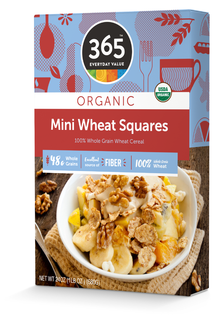
365 Organic, 2016
Approchable Organic with a Colorful Personality.
365 Organic, 2016
Approchable Organic with a Colorful Personality.
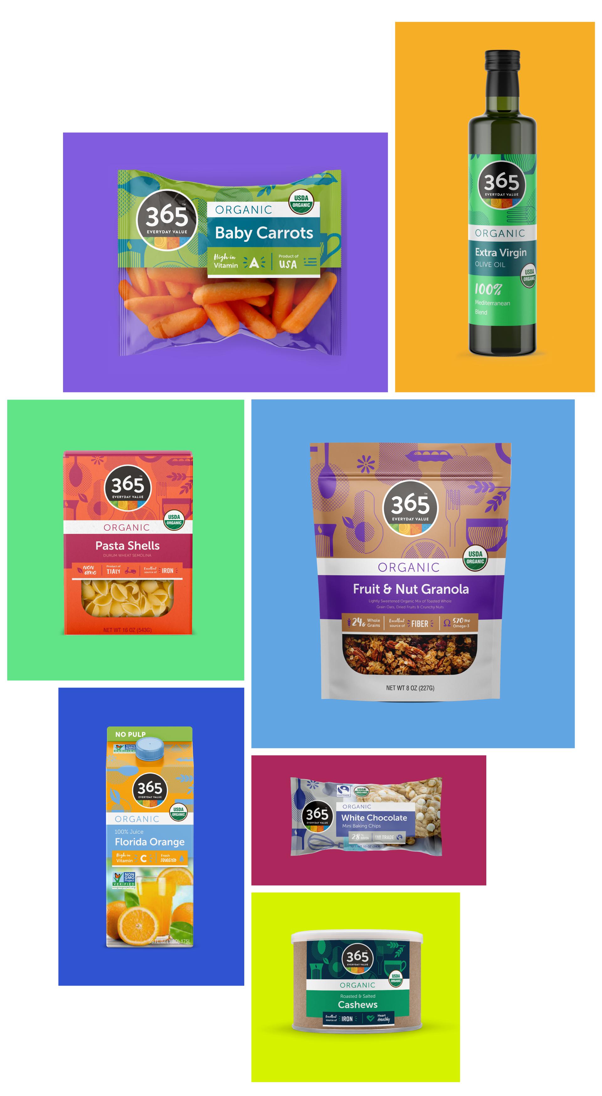
365 Everyday is WFM nationally recognized flagship private label brand, spanning a number of product lines represented in every aisle of their stores. The system has to work across several hundreds of SKUs, different product lines, and production applications.
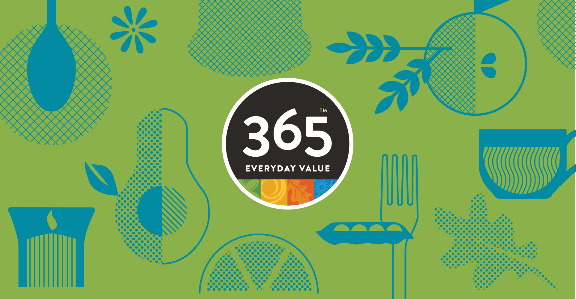
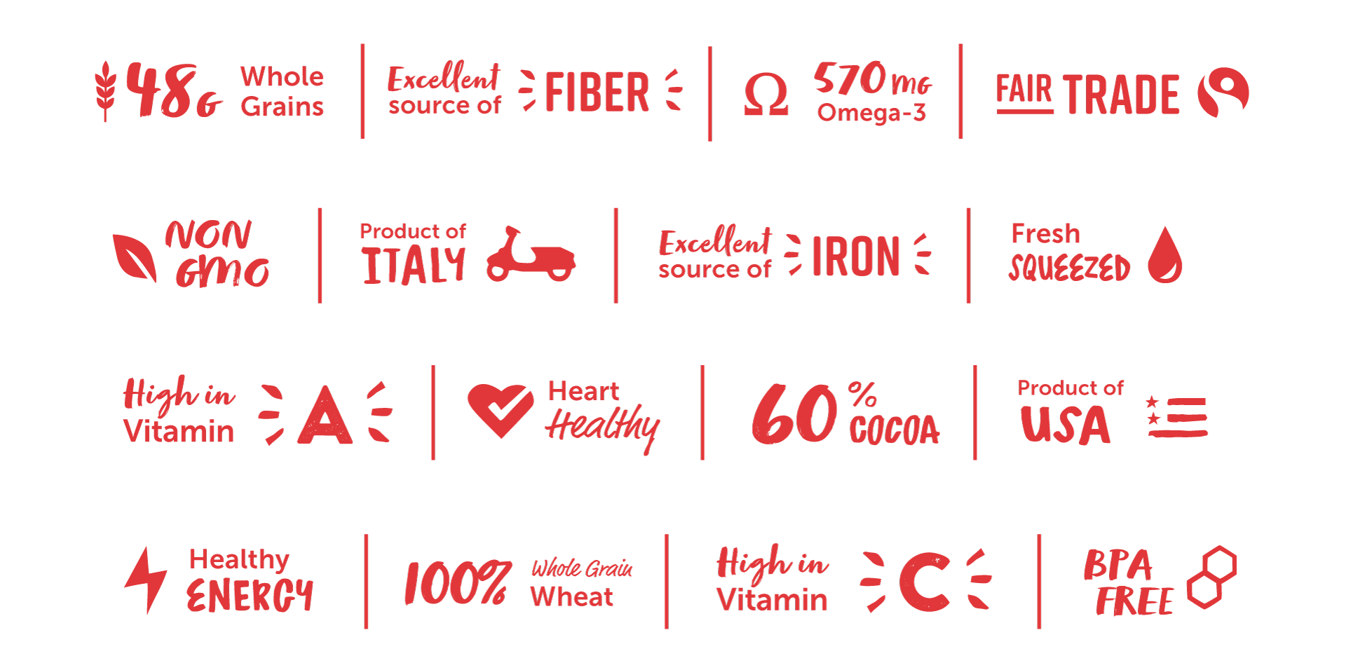
With greens and brown being ubiquitous the healthy and organic spaces, we saw an opportunity to use bolder color choices to stand out. We utilized the whole color spectrum in a two tone color approach featuring an evocative wallpaper of rotating players, thematically encompassing the breadth of the 365 product line. Clean straightforward product type was balanced with playful illustrative benefits, resulting in a bold and flexible system.
My Role
My Role
Packaging Design System, Visual Design, Iconography
Packaging Design System, Visual Design, Iconography
Credits
Agency – Trigger Design
Matt Sanders – Creative Director
Matt Rowland – Creative Director,
Agency – Trigger Design
Matt Sanders – Creative Director
Matt Rowland – Creative Director
Imported Gourmet
Regional Inspired Delight for the Food Adventurer.
Imported Gourmet
Regional Inspired Delight for the Food Adventurer.
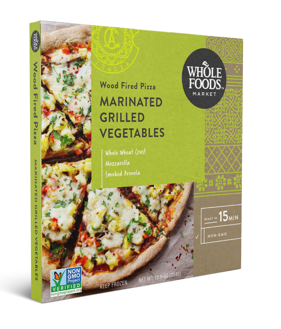
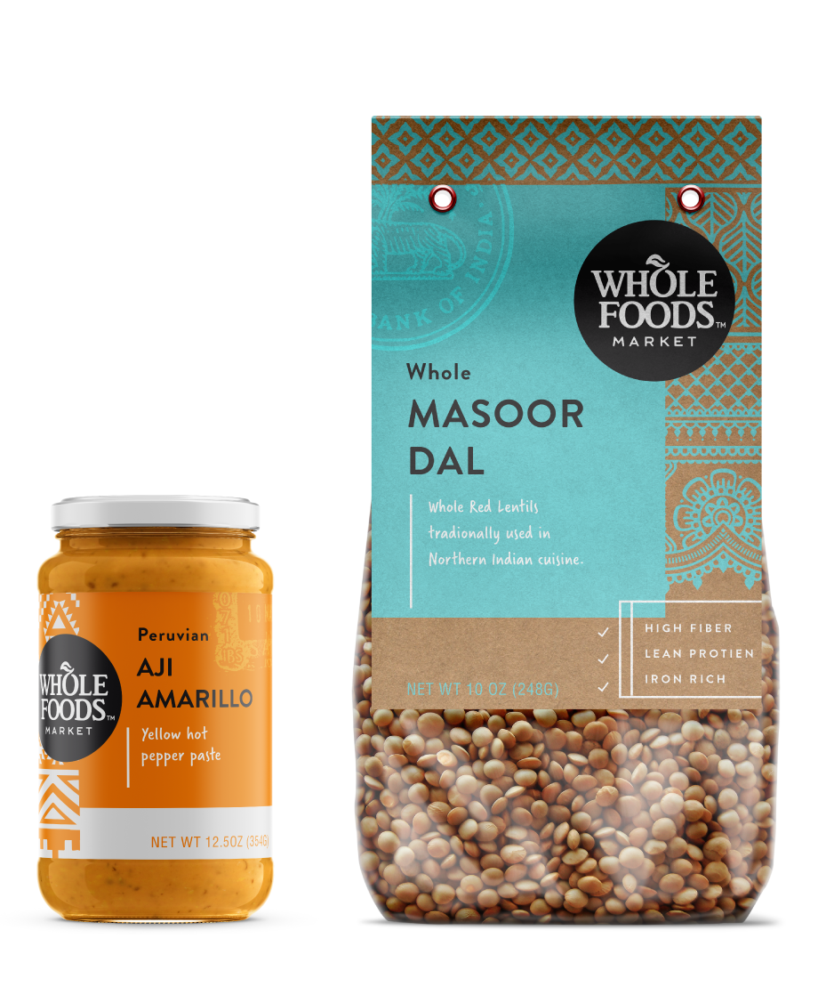
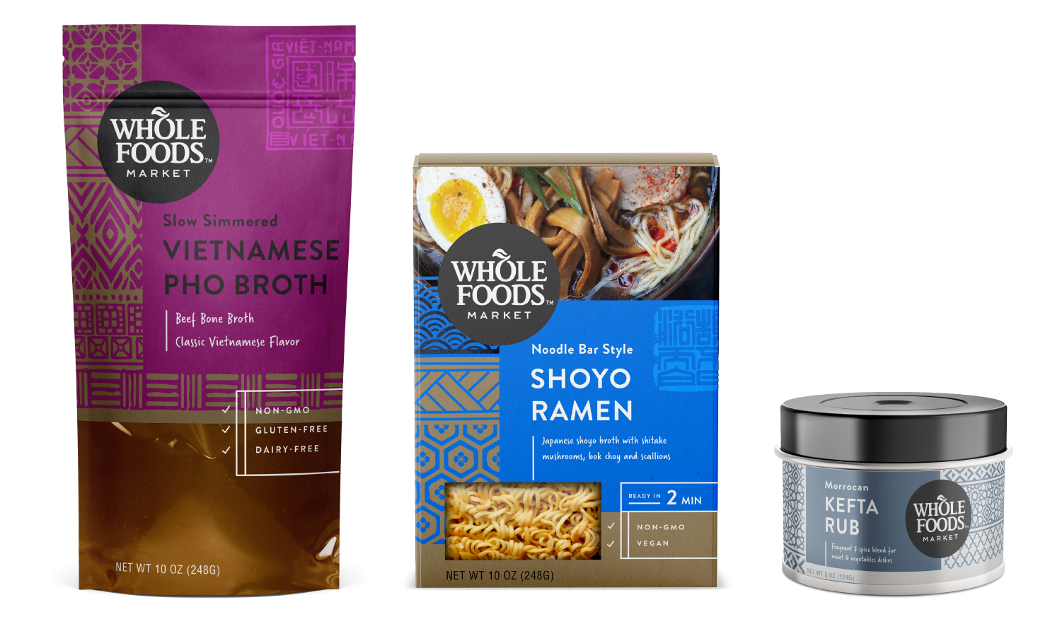
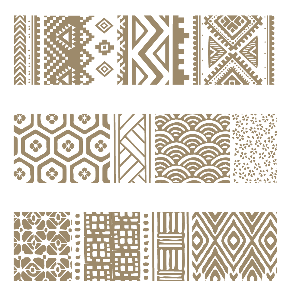
The Imported Gourmet line aims to appeal to the adventurous customer looking to branch out from their routine and try trending, internationally or regionally-inspired flavors and ingredients.
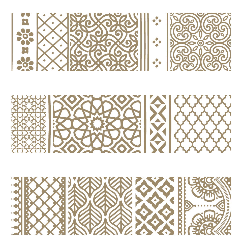
I looked to textures and inspiration from the regions, and created a patch-work, tapestry-like custom pattern-scape that felt screen printed when applied. The pattern-scape told a story of authenticity, craft and uniqueness though sense of place. A bold vibrant flavor color was offset with just white and black accents, against the substrate texture. The line has a more authentic, regionally-found, specialty item feel to help drive those customers to be adventurous.
My Role
My Role
Packaging Design, Visual Design, Patterning
Packaging Design, Visual Design, Patterning
Credits
Agency – Trigger Design
Matt Sanders – Creative Director, Matt Rowland – Creative Director
Live Healthy
Minimally Processed Plant Based Foods.
Live Healthy
Minimally Processed Plant Based Foods.
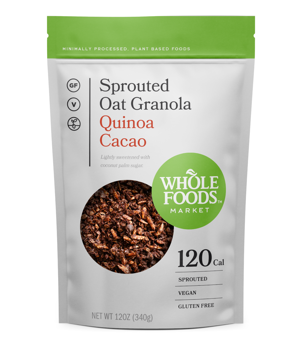
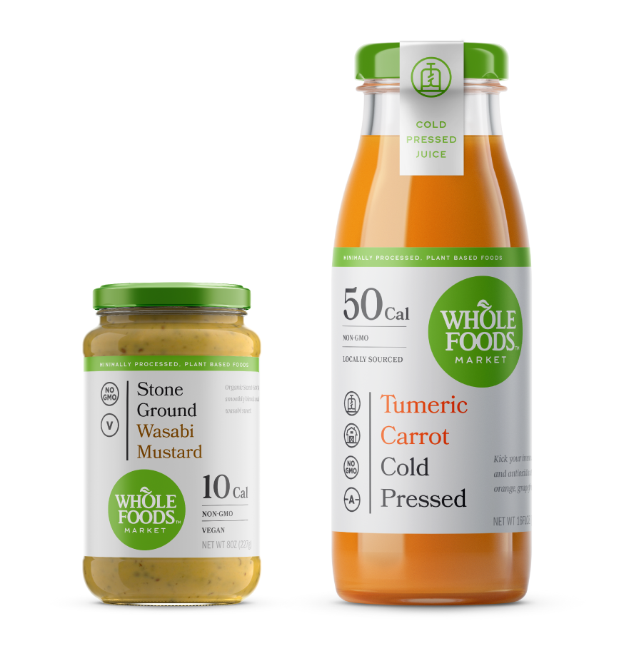
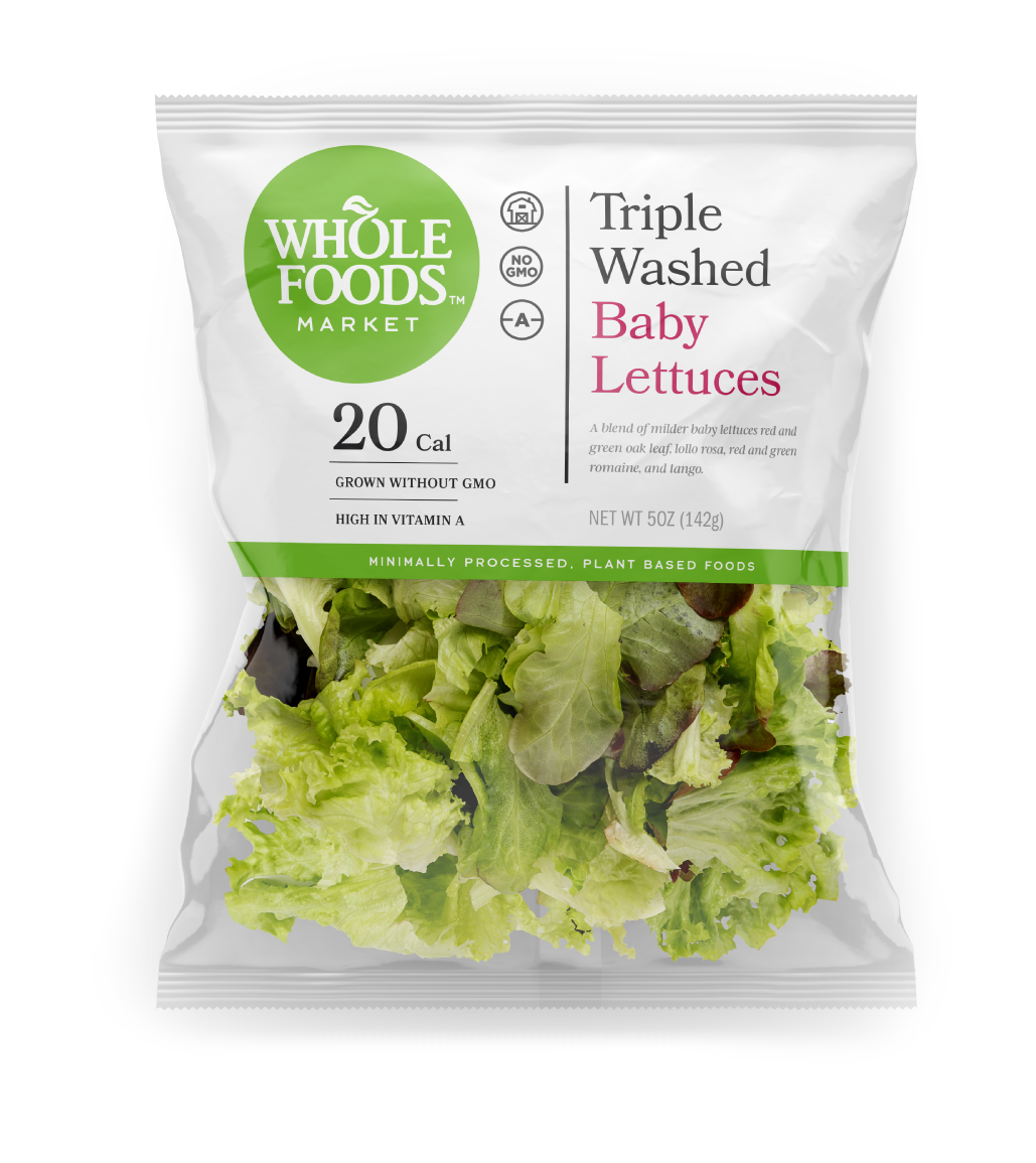
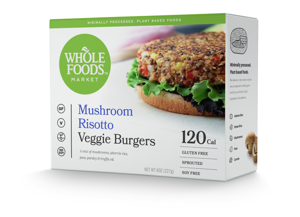
The Live Healthy line, has a simple mission to bring the consumer minimally processed, plant-based products. The goal was to make healthy eating accessible and convenient.
I stripped down the packaging highlighting key health and nutrition claims and benefits. Minimal flavor cues were used, instead opting for the brand colors green, black and white, in order to help identify the line and promote the mission across the store. Large type, simple calorie counts, and a quick-read icon system for benefits and claims help consumers make easy healthy choices.
My Role
Packaging Design System, Visual Design, Iconography
Packaging Design, Visual Design, Iconography
Credits
Agency – Trigger Design
Matt Sanders – Creative Director,
Matt Rowland – Creative Director
Agency – Trigger Design
Matt Sanders – Creative Director, Matt Rowland – Creative Director
365 Everyday Value, 2014
Simple. Accessible. Everyday.
365 Everyday Value, 2014
Simple.
Accessible.
Everyday.
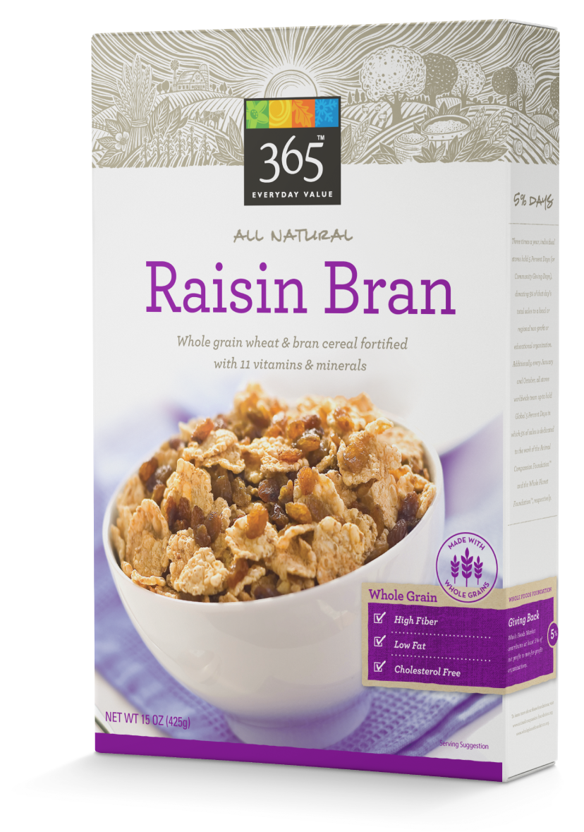
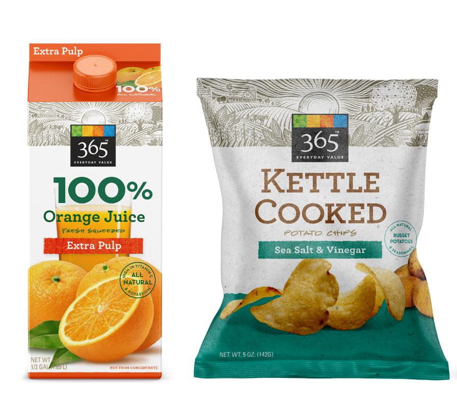
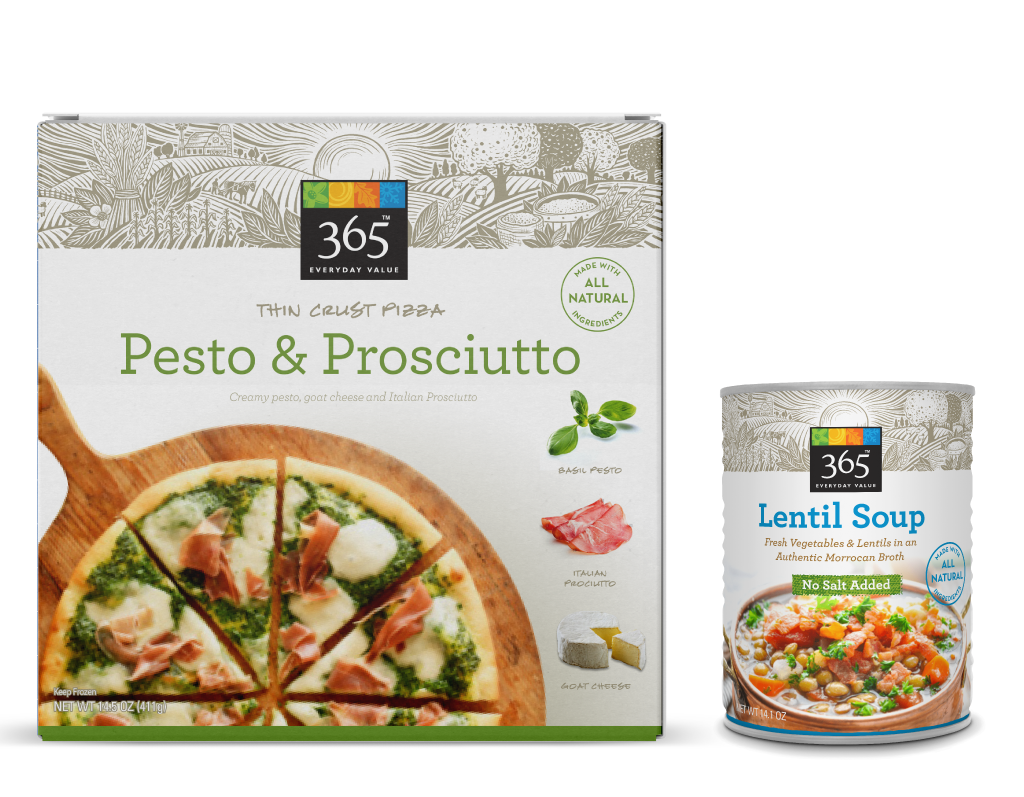
We designed 365 concurrently with the 365 Organic line with the goal that these two should share familial traits (Trusted Quality, Affordability, Accessible, Thoughtful Simplicity) but each should have their own distinct personalities. For 365, our goal was to be the weeknight meal in a busy schedule - unfussy, easy, healthy, everyday.
The system is anchored by a illustrative stylized farm scene locked up with the 365 mark, that reinforces simple and natural. Vignetted photography against white, a no nonsense benefit claim system, natural textures, and friendly type reinforced everyday and unpretentious. The system allowed for personality to shine when needed through varied applied typography, illustration, and photography.
We designed 365 concurrently with the 365 Organic line with the goal that these two should share familial traits (Trusted Quality, Affordability, Accessible, Thoughtful Simplicity) but each should have their own distinct personalities. For 365, our goal was to be the weeknight meal in a busy schedule - unfussy, easy, healthy, everyday.
My Role
Packaging Design System, Visual Design, Iconography, Brand Guideline Creation, Illustration & Photography Direction
Packaging Design System, Visual Design, Iconography, Brand Guideline Creation, Illustration & Photography Direction
Credits
Agency – Trigger Design
Matt Sanders – Creative Director, Matt Rowland – Creative Director, Gina Triplett – Illustration, Photography – Whole Foods In House Team
Agency – Trigger Design
Matt Sanders – Creative Director, Matt Rowland – Creative Director, Gina Triplett – Illustration, Photography – Whole Foods In House Team

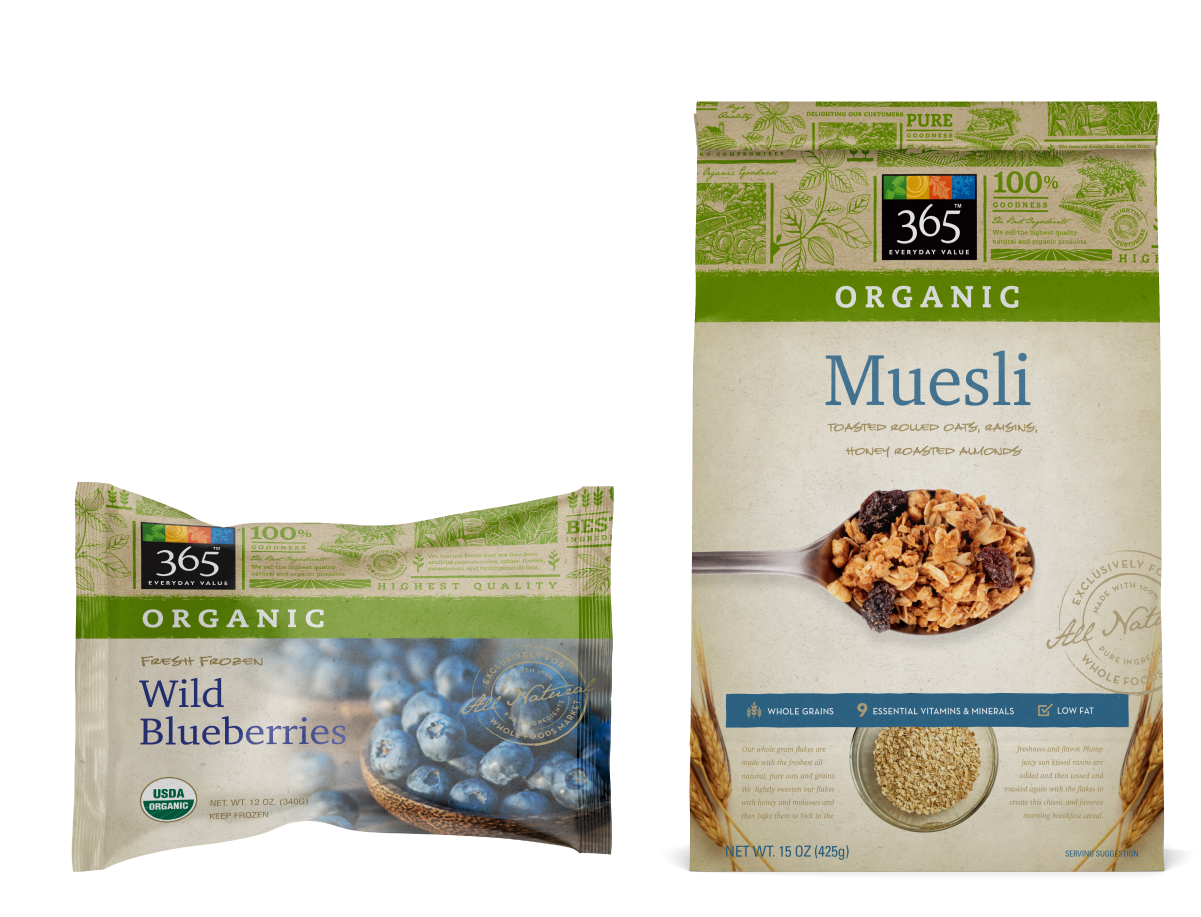
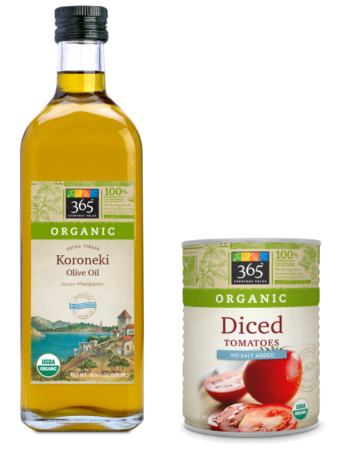
365 Organic, 2014
Pure Organic Goodness.
The 365 Organic line shared the same familial traits as 365 (Trusted Quality, Affordability, Accessible, Thoughtful Simplicity) but needed to differentiate immediately as Organic while retaining that familial feel.
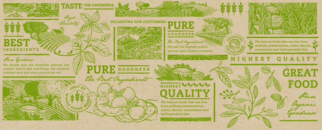
We used the same visual footprint area as 365 Everyday for an illustrative typographic collage wallpaper to clearly distinguish the line as Organic. Other organic tones and markers were folded in – a muted color scheme, shallow depth of field photography, craft and natural textures, as well as hand applied stamps and simple benefit claims.
My Role
My Role
Packaging Design System, Visual Design, Iconography, Brand Guideline Creation, Illustration & Photography Direction
Credits
Agency – Trigger Design
Matt Sanders – Creative Director, Matt Rowland – Creative Director, Gina Triplett Illustration, Photography by Whole Foods In House Team
Agency – Trigger Design
Matt Sanders – Creative Director, Matt Rowland – Creative Director, Gina Triplett – Illustration, Photography by Whole Foods In House Team
Selected Works






Aaron Pedroza | Creative Director | NYC SF | get in touch
Aaron Pedroza
Creative Director | NYC SF | get in touch